Customize Your Task Flow
Now that you have set up your initial task flow let's customize some of the content within it. In this section you will learn how to remove, add, and edit sections in a task flow page.
Remove an Element
Often you won't want to use all of the page elements that come with a Task Flow. For this tutorial, you remove the "Related Data" table in the preview panel that displays when you click on a row. Because you don't have any nested or linked data for each planet in the table, this element isn't useful to the UI right now.
First, look inside the src/app/solar-system/ directory that was generated when you first added your task flow:
These are the files that determine how this specific Task Flow will be rendered in the UI. Some of these files reference other components that are common to the whole app, but these components are specific to the solar-system Task Flow.
For this step, open PreviewPanel.tsx because the "Related Data" table is in the preview panel.
Next, find the code that renders the "Related Data" section:
<Box>
  <Typography fontWeight="medium" mb={1}>Related Data</Typography>
  <DataGrid
    rows={relatedRows}
    columns={relatedColumns}
    disableRowSelectionOnClick
    initialState={{
      pagination: { paginationModel: { pageSize: 5 } }
    }}
  />
</Box>
This section of code includes a Box component to wrap around the whole section, a Typography component to display the section heading, and a DataGrid component to display the related data in a table.
Delete this whole section of code, from <Box> to </Box> and save PreviewPanel.tsx. Refresh the Explorer page in the browser. The "Related Data" section should now be gone and the "View Details" and "Export Data" buttons should be directly below the other content.
Edit the Preview Panel Content
Now let's make the preview panel display more useful information. In this step, you are going to edit the property-value tables in the preview panel so that they display data from your data source: planets.csv.
With PreviewPanel.tsx open, find the code that renders the "Property Group 1" section:
<Box>
  <Typography fontWeight="medium" mb={1}>Property Group 1</Typography>
  <LabelValueTable
    rows={[
      { label: 'Property 1', value: 'value' },
      { label: 'Property 2', value: 'value' },
      { label: 'Property 3', value: 'value' },
    ]}
  />
</Box>
Just like the "Related Data" section, there is a Box component and a Typography component but there is also a LabelValueTable component. This component renders a list of properties and their values in a readable two-column format.
Replace the Section Label
For this first section, let's display the physical characteristics of the planet. Replace "Property Group 1" with "Physical Characteristics".
<Typography fontWeight="medium" mb={1}>Physical Characteristics</Typography>
Refresh your browser and make sure "Physical Characteristics" displays as the section label.
Connect your data to the preview panel using the state variable
Next, you will replace the rows in the LabelValueTable with data from the planet that the user has clicked. To do this, you need to access the props of the PreviewPanel component. This component has a prop called previewItem. Data in the previewItem prop is dynamic. This means that it changes based on actions that the user takes or external events like data requests. In this case, it changes when a user clicks on a row in the main data table.
In the PreviewPanel component, the previewItem prop is defined near the top of the component:
export const PreviewPanel: React.FC<PreviewPanelProps> = ({ previewItem, onClose }) => {
  ...
}
There are other pieces here, but for now just focus on the previewItem variable. When a user clicks on a row in this task flow, the data in that row is stored in previewItem. Now, replace "Property 1" in the first LabelValueTable with the "Diameter" property for the selected planet:
<LabelValueTable
  rows={[
    { label: 'Diameter', value: previewItem['Diameter'] },
    { label: 'Property 2', value: 'value' },
    { label: 'Property 3', value: 'value' },
  ]}
/>
Here you have replaced the first label with "Diameter" and replaced the value with the value of the Diameter property from the selected row. Refresh the page and make sure your see a number next to the "Diameter" label in the preview panel. Click around to different rows. Do you see the number changing?
Add a few more dynamic rows to the table in this section:
<LabelValueTable
  rows={[
    { label: 'Diameter', value: previewItem['Diameter'] },
    { label: 'Mass', value: previewItem['Mass'] },
    { label: 'Surface Gravity', value: previewItem['SurfaceGravity'] },
  ]}
/>
Notice that you can access properties that aren't displayed in the main table. Even though SurfaceGravity wasn't defined in the main table columns, it is still part of the underlying data so it is present in the internal task flow state. Also notice that the label can be any string you want, but the value must use the exact name of the property column in planets.csv.
Next, add dynamic rows to the second LabelValueTable. Replace the section label "Property Group 2" with "Orbital Characteristics" and add dynamic data points for the other columns in planets.csv:
<Box>
  <Typography fontWeight="medium" mb={1}>Orbital Characteristics</Typography>
  <LabelValueTable
    rows={[
      { label: 'Inclination', value: previewItem['Inclination'] },
      { label: 'Eccentricity', value: previewItem['Eccentricity'] },
      { label: 'Semi Major Axis', value: previewItem['Semi_majorAxis'] },
      { label: 'Orbital Period', value: previewItem['OrbitalPeriod'] },
      { label: 'Sidereal Rotation', value: previewItem['SiderealRotation'] },
      { label: 'Satellites', value: previewItem['Satellites'] },
    ]}
  />
</Box>
Refresh the page and make sure you see dynamic values in both sections of the preview panel.
Let's clean up the preview panel so that there's no more placeholder content. Find the placeholder subtitle section and remove it:
// Delete this line
<Typography variant="body2">Row description, subtitle, or helper text.</Typography>
Now find the code that renders the "Preview Heading":
<Typography variant="h6" component="h3" flex={1}>
  <Link component={RouterLink} to="." underline="hover">
    Preview Heading
  </Link>
</Typography>
Replace "Preview Heading" with the name of the planet by accessing the Name column:
<Typography variant="h6" component="h3" flex={1}>
  <Link component={RouterLink} to="." underline="hover">
    {previewItem['Name']}
  </Link>
</Typography>
Here you are doing the same thing you did in the LabelValueTable components, except there is one small difference: the variable is wrapped with curly braces {...}. This is necessary because in React, curly braces indicate that a variable or function is going to be used in the component, otherwise it would render the literal text, "previewItem['Name']". This wasn't necessary in the LabelValueTable because there are already curly braces around the whole row prop.
Refresh the page. You should see the planet name at the top of the preview panel.
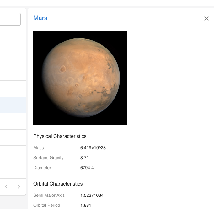
Add dynamic images
In this step you will add an image for each planet and display it in the preview panel. First, create a new images directory inside the public/ directory at the top level of the app.
Then, download the planets.zip file using the link below:
Double-click the planets.zip file you downloaded to unpack the files, then drill into the planets directory and copy the 8 files. There should be one file for each planet.
Paste the 8 planet images into public/images.
Now you are ready to start incorporating the images into the preview panel. Open PreviewPanel.tsx and fine the "Physical Characteristics" section you edited earlier:
<Box>
  <Typography fontWeight="medium" mb={1}>Physical Characteristics</Typography>
  <LabelValueTable
    rows={[
      { label: 'Diameter', value: previewItem['Diameter'] },
      { label: 'Mass', value: previewItem['Mass'] },
      { label: 'Surface Gravity', value: previewItem['SurfaceGravity'] },
    ]}
  />
</Box>
Add an <img> tag directly above this section. The img tag uses the src attribute to tell it which image to display. In this case, you want the image to be different depending on the row that is selected. To do that, you are going to inject the planet's name into the path to the image:
<img src={`images/${previewItem['Name']}.jpg`}/>
Here you are using a JavaScript syntax called a template literal. Instead of using quotes to wrap the string, you use backticks (`) which lets you embed dynamic content inside the string using a dollar sign and curly braces (${expression}).
Refresh your browser and check that the planet images are showing up in the preview panel when you click on a planet row.
This is great but the images are looking a little too big. Let's add a uniform height to the images so that users can more easily see both the image and the characteristics data.
To do this, import the ImageWrapper component below the other imports at the top of the file:
import { ImageWrapper } from '../../components/ImageWrapper';
Then wrap your image with the ImageWrapper component and specify a height using the component's height prop:
<ImageWrapper height="300px">
  <img src={`images/${previewItem['Name']}.jpg`} />
</ImageWrapper>
To make sure the images are accessible, add alt text to the img tag. Alt text is used by screen readers to describe images to users and it is also displayed if the image has trouble loading.
<ImageWrapper height="300px">
  <img src={`images/${previewItem['Name']}.jpg`} alt={`Satellite image of ${previewItem['Name']}`} />
</ImageWrapper>
Refresh your page and make sure the images are smaller and all the same height.
Woohoo! You're done with task flow customizations for now.
Next Steps
At this point you have a task flow that is starting to be tailored to a particular data source and use-case. In the next section you will learn how to customize the app as a whole and make it your own.